Client
Ontario Christian Schools
Project
Identity System
Components
Graphic Design
Details
CCG recently provided Ontario Christian Schools with an updated logo, website and brochure.
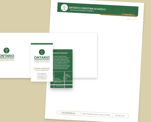
The 1st project undertaken by CCG was to refresh the school’s logo mark. The mark features modern, sans serif typography while also incorporating elements of the existing logo to provide a sense of continuity.
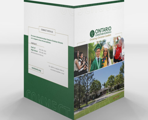
Next, CCG designed a custom presentation folder for use in admissions and marketing. The folder’s design incorporates the rich green-and-gold color scheme of the school’s colors. Custom photography provided by CCG features students in their element and provides a glimpse of life at OC.
CCG has helped Ontario Christian School roll-out the revised logo mark across business cards, advertisements, newsletters, and even school vehicles (not produced by CCG).


